 With Facebook edging out Google as the #1 website in the world, Google’s changing their approach to focus more on ‘the social experience’.
Investment in social media just became even more important to your online success.
Since Google owns YouTube, the world’s largest video host, Google just announced they’re making YouTube more than just a Video Search Engine – like Facebook, YouTube will become a social experience, too.
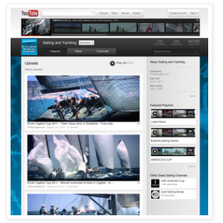
YouTube announced their new “Cosmic Panda” user experience on their blog, so I checked it out.
What is different about Cosmic Panda?
NAVIGATION:
The cleaner, updated look is refreshing and allows a user to easily navigate the site and channels. I believe it will allow for a more user-friendly experience.
 VIDEO LOOK:
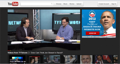
When you click on a video to watch, it opens in a new screen. On start up, it jumps to the left to allow an ad to show on the right. Hopefully they fix this in the final version because the video screen movement is annoying.
Underneath the video are thumbnails of suggested videos. The overall look is nice and reminds me a little of a ‘movie theatre’ look.
EMPHASIS ON COMMENTS and SUBSCRIBERS:
One of the nicer improvements is the more prominently featured location of the comments and subscribers. Google probably wouldn’t appreciate the comparison but it has a Facebook wall feel to it.
Most likely this is on purpose in the hopes that it encourages video viewing and commenting to move to a more ‘social’ level than it has been in the past.
Will Google’s new ‘Social Emphasis’ change the way we watch videos?
Here’s a link to the YouTube blog announcement so you can see the new Cosmic Panda beta version for yourself.
What did you like about the new version of Cosmic Panda? What do you think is missing?
